
Interesting in troubleshooting your network programmatically? One of the more valuable things I’ve learned while brushing up on AI/ML is exploratory data analysis (EDA) techniques. Here’s an example of using Jupyter notebooks and API calls to slice and dice through your production data to help make informed decisions.
Problem Statement:
A critical class of network clients is reporting poor experience on an 802.1X network. There are lots of intermittent issues seen in the days after a site is initially upgraded. The relevant SSID does not have 802.11r enabled during the migration process to avoid interoperability issues as the previous vendor is replaced in phases. The odd part is the client vendor reports that things improve slowly over several days even without any network configuration changes. We want to find out why.
Approach:
We have a lot of good data in the existing tools in Mist. To be clear, every single data element I am pulling in this exercise is also front-and-center in the GUI. We can also use things like our Time-to-Connect SLE or the Roaming SLE for larger scale analysis. But here’s one of my favorite parts in Mist – every action in the Mist dashboard has an underlying API call. Using this we can create a script for rapid targeted analysis and iteration for in-depth troubleshooting at scale.
Jupyter notebooks make it possible to tell a story with Python. You can execute Python cells and view the results as you go, making it much easier to dive into the data.
To get started with Jupyter:
https://jupyter.org/
In this case a quick visual analysis of the dashboard shows that it may be an issue with lengthy authentication times on this 802.1X network. We’ll use a Jupyter notebook to focus the analysis onto a particular client set and attempt to prove out our theory.
THE CODE:
First we need to load in the supporting modules:
import requests
import json
import pandas as pd
import seaborn as sns
We’re going to use requests to grab data from Mist, Pandas to work with dataframes, and Seaborn to visualize the data.
Next, set the variables:
cloud = [Mist instance]
siteid = [site ID]
start = [epoch_start]
end = [epoch_end]
ssid = [ssid you want to analyze]
APITOKEN = [use caution!]
Obviously these are placeholders. You can set these values to iterate this notebook as needed – you can target a new site, target a new time range, target a new SSID, etc – and these variables control the rest of the data gathering as you execute the rest of the code.
Two important notes:
- Mist uses epoch time.
- Use extreme caution storing any kind of API Token directly in the script, especially one that has write permissions. Don’t let an administrative token out into the wild.
Next we’ll set the headers so that the token is provided appropriately as we make our API calls.
headers = {
    'Content-Type': 'application/json',
    'Authorization': 'Token ' + APITOKEN
}
Next let’s grab the authentication failure count. To do this we’ll build out the URL by using f-string syntax to leverage the variables we defined earlier.
authurl = f'https://api.{cloud}.mist.com/api/v1/sites/{siteid}/clients/events?limit=1000&start={start}&end={end}&ssid={ssid}&type=MARVIS_EVENT_CLIENT_AUTH_FAILURE'Next, let’s iterate through several calls.
failed_auth_lod = []
raw_auth_fail = requests.get(authurl, headers=headers)
responsejson = raw_auth_fail.json()
while "next" in responsejson:
    #Grab what we have from the most recent call
    failedauthlist = responsejson['results']
    print(failedauthlist)
    #Append it to the failed_auth_list_of_dicts
    failed_auth_lod.extend(failedauthlist)
    print(failed_auth_lod)
    #Next, grab the URL details from the current responsejson:
    more = responsejson['next']
    url2 = f'https://api.{cloud}.mist.com{more}'
    print(f'Hold on, grabbing more data from {url2}')
    nextrequest = requests.get(url2, headers=headers)
    responsejson = nextrequest.json()
else:
    failedauthlist = responsejson['results']
    failed_auth_lod.extend(failedauthlist)
Mist paginates event in lists of 1000. This code creates a blank “list of dictionaries” for failed authentications on the targeted SSID across the given timeframe and then runs API calls until all failed authentications have been seen and added to the list.
We can then convert this into a pandas dataframe and save it for later:
failedauth_dataframe = pd.DataFrame(failed_auth_lod)Next, we do a very similar exercise for associations:
associationurl = f'https://api.{cloud}.mist.com/api/v1/sites/{siteid}/clients/events?limit=1000&start={start}&end={end}&ssid={ssid}&type=associations'total_association_lod = []
associations = requests.get(associationurl, headers=headers)
responsejson = associations.json()
while "next" in responsejson:
#Grab what we have from the most recent call
associationlist = responsejson['results']
total_association_lod.extend(associationlist)
#Next, grab the URL details from the current responsejson:
more = responsejson['next']
url2 = f'https://api.{cloud}.mist.com{more}'
print(f'Hold on, grabbing more data from {url2}')
nextrequest = requests.get(url2, headers=headers)
responsejson = nextrequest.json()
else:
associationlist = responsejson['results']
total_association_lod.extend(associationlist)association_dataframe = pd.DataFrame(total_association_lod)Great, now we have two dataframes we can use to get started.
When Mist is deployed with standard roaming we enable PMKC by default. First, we want to see a breakdown of how many full auths we saw on this SSID and how many auths were accelerated via PMKC. We can create a histplot with Seaborn using this code:
sns.histplot(data = association_dataframe, x='auth_type')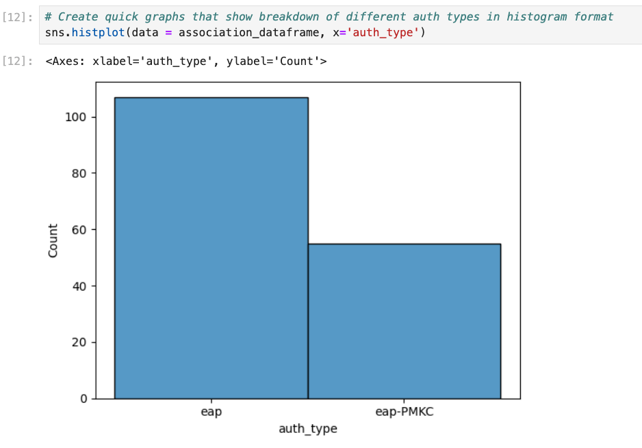
You can also use Seaborn to show which RADIUS servers were responsible for authentication failures.
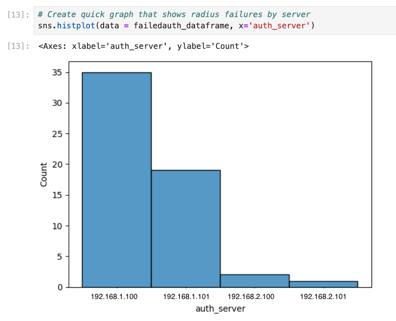
sns.histplot(data = failedauth_dataframe, x='auth_server')You can also breakdown the value_counts for the reasons why RADIUS failed:
print(failedauth_dataframe['authorization_reason_msg'].value_counts(normalize=True))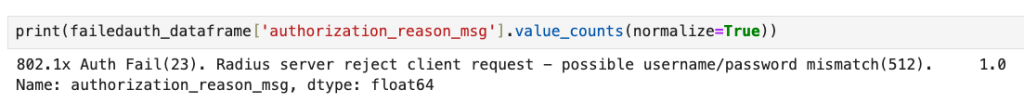
Next, use the association dataframe to create a list of the different active clients seen at this site. We’re also going to create a new empty dataframe called “clientanalysis” that has four columns that we’re interested in.
clientlist = association_dataframe['mac'].unique().tolist()
clientanalysis = pd.DataFrame(columns=['mac', '% accel', 'avglatency', 'maxlatency'])
Now we iterate through this list of clients. There’s a good number of actions happening here:
- Grab the total number of full authentications seen for the client
- Grab the total number of PMKC associations seen for the client
- Determine what % of associations seen were accelerated by PMKC
- Use the API to pull the authentication latency seen across the day for the client
- Create the average authentication latency seen for the client
- Grab the max authentication latency seen for the client
- Add this data to the “clientanalysis” dataframe and move on to the next client
for client in clientlist:
    fullauthdataframe = association_dataframe.loc[(association_dataframe['mac'] == client) & (association_dataframe['auth_type'] == 'eap')]
    fullauthcount = fullauthdataframe.shape[0]
    accelauthdataframe = association_dataframe.loc[(association_dataframe['mac'] == client) & (association_dataframe['auth_type'] == 'eap-PMKC')]
    accelauthcount = accelauthdataframe.shape[0]
    totalauthcount = fullauthcount + accelauthcount
    percentage_accelerated = accelauthcount / totalauthcount
    authlatencyurl = f'https://api.{cloud}.mist.com/api/v1/sites/{siteid}/insights/client/{client}/stats?start={start}&end={end}&interval=600&metrics=client-auth-latency'
    authlatencypayload = requests.get(authlatencyurl, headers=headers)
    authlatencypayloadjson = authlatencypayload.json()
    authlatencylist = authlatencypayloadjson['client-auth-latency']
    nonull_latencylist = list(filter(None, authlatencylist))
    maxlatency = max(nonull_latencylist)
    avglatency = sum(nonull_latencylist) / len(nonull_latencylist)
    clientresults = [client, percentage_accelerated, avglatency, maxlatency]
    clientanalysis.loc[len(clientanalysis)] = clientresults
Now we have the dataset ready for analysis. We’ll use Seaborn to look for correlation between average authentication latency and % of accelerated auths:
sns.lmplot(data=clientanalysis, x='% accel', y='avglatency')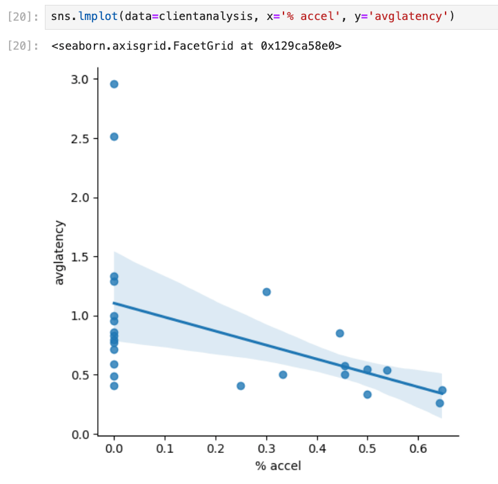
Next we’ll sketch out the max auth latency seen at the site:
sns.histplot(data=clientanalysis, x='maxlatency', kde=True)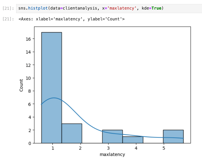
Finally, we’ll grab the top five worst offenders for total latency seen in authentication. I’m not showing the results from this analysis here but here’s the code you can use:
clientanalysis.sort_values(by=['maxlatency'], ascending=False).head(5)THE ANALYSIS:
We now have a way to rapidly get the desired data! All we need to do is change the values at the start to target a different time window/site/SSID, rerun the code, and compare the results between the different days.
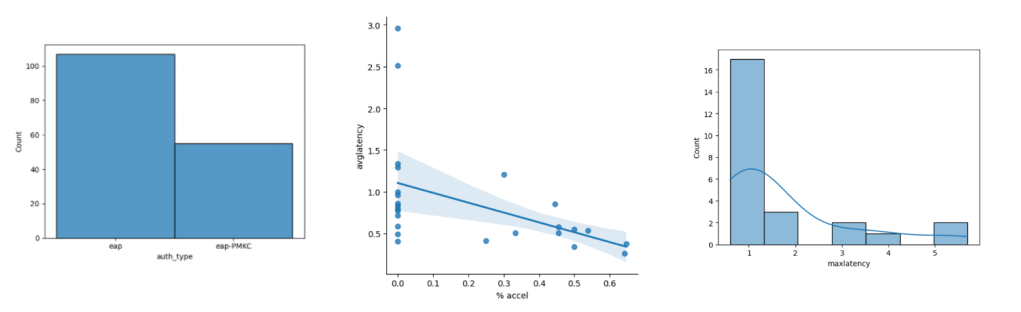
Here’s the comparison between the two days in question – the first day reported issues, the second day saw an improvement.
DAY 1:
DAY 2:
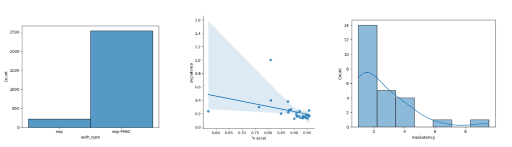
From these visualizations we can quickly see several things:
- The second day saw much higher activity in general.
- The second day saw a much higher amount of accelerated auths as compared to full auths, possibly because clients had already authenticated against a number of APs already and had cached keys.
- The second day saw much lower average authentication times but higher maximum authentication times.
- We see a very clear correlation on a client-by-client basis for average authentication latency and the % of times PMKC was able to pitch in (as expected, but this scatter plot visually proves it out).
- We’re seeing some high “max latency” values on both days – we need to take a closer look at some of those events and make sure that these were client-side anomalies and not server-side issues.
The scatter plot for the second day also shows an extreme outlier – there was a client that saw just over 80% accelerated roams for the day but they still saw an average authentication latency of almost 1s. Visualizing datasets makes it much easier to notice outliers. Looking into the underlying data I can see that this client saw a maximum latency value of almost 10 seconds at one point in the morning (!) which really dragged the average up. This was a client specific issue due to poor RSSI.
THE VALUE OF EDA:
Again, this data is in the GUI. I’m not trying to illustrate that you need programming knowledge to troubleshoot the wireless network. However it only takes me ~15 seconds to run through this notebook on a frankly aging computer and that includes generating the graphs. This allows you to create a very customized query to prove (or disprove) theories across a large environment. You can use techniques like this to clearly quantify the impact of changes. This notebook is easy to expand to other systems as necessary. And it is highly customizable and modular – I can re-use portions of this to assess the effectiveness of things like OKC given a particular client mix or to determine if certain device types take longer to authenticate.
In summary, learning good EDA techniques can help you truly quantify the performance of your network and start minimizing “It Depends.”

One thought on “Networking EDA”