
For this post I will show you an example of how you can use ML to determine common characteristics seen by clients experiencing poor coverage in your WLAN.
I want to note upfront that this is a science project intended to illustrate the inner workings of a machine learning algorithm, not a cure for poor RF design or a replacement for the Mist SLEs. This post will also assume that you are familiar with the following tools:
- Python
- Pandas / Numpy
- Jupyter
I will provide the code that I used as well as several links for additional reading if you’d like to dive deeper into the theory.
As another disclaimer these correlations can be more easily accessed by using the SLEs within the Mist dashboard!
STEP 1: Gathering the Data
Everything you see in the Mist GUI can also be pulled via the API. As part of the client coverage analysis Mist continuously tracks the client-to-AP RSSI for each client for each minute and highlights “degraded” minutes when the client goes below the -72dBm threshold (this is the default value and it can be modified). To pull a list of clients impacted by poor coverage at a given site you can use this call:
https://[cloud-instance]/api/v1/sites/[site_id]/sle/site/[site_id]/metric/coverage/impacted-users?This will return JSON data in this syntax:
    "users": [
        {
            "name": "rokupremiere-035",
            "mac": "d83134d20474",
            "ap_mac": "d420b0406630",
            "ap_name": "OFFICE",
            "wlan_id": "9f87cdd9-4d7a-449f-b894-464635586da6",
            "vlan_id": null,
            "ssid": "Sammich",
            "device_type": "Roku",
            "device_os": "12.5",
            "duration": 9052,
            "degraded": 375,
            "total": 9052
        },
You can see that this Roku has been connected to SSID “Sammich” for 9052 minutes. Out of those 9052 minutes, 375 of them were at a signal level worse than -72dBm (shown in the degraded key-value pair).
Using a quick Python script you can iterate this call through each site in the Mist dashboard, grab the users impacted by poor coverage at the site level, and add them to a dataframe for analysis.
Here is a sample script that runs through an org to grab the site IDs, grabs the information on users impacted by degraded coverage, and then writes the user details to a dataframe. You can either run this as a standalone script and grab the outputs into a .csv or implement this code directly in the Jupyter notebook that we’ll explore in the next several sections.
import requests
import os
import pandas as pd

# USE SCRIPT AT YOUR OWN RISK. THIS IS OFFERED "AS-IS"

org = ENTER VALUE HERE
cloud = ENTER VALUE HERE
APITOKEN = os.environ.get("APITOKEN")

headers = {
    'Content-Type': 'application/json',
    'Authorization': 'Token ' + APITOKEN,
    'User-Agent': 'Jakarta Commons-HttpClient/3.1',
    'X-SNC-INTEGRATION-SOURCE': 'c0201333db0962406934dba8bf96195a'
}

orgurl = f'https://{cloud}/api/v1/orgs/{org}/sites'
sitelist = requests.get(orgurl, headers=headers)
sitelistjson = sitelist.json()
sites = []

for i in sitelistjson:
    siteid = i['id']
    sites.append(siteid)

df = pd.DataFrame()

for each in sites:
    siteurl = f'https://{cloud}/api/v1/sites/{each}/sle/site/{each}/metric/coverage/impacted-users'
    impactedusers = requests.get(siteurl, headers=headers)
    impactedusersjson = impactedusers.json()
    siteimpactedusers = impactedusersjson['users']
    site_df = pd.DataFrame.from_records(siteimpactedusers)
    site_df['site_id'] = each
    df = pd.concat([df, site_df])

df.to_csv('impacted_users.csv', encoding='utf-8', index=False)
In this case we are writing the results to a local .csv file titled “impacted_users.csv.” If you have a very large installation it can be useful to store the data as a separate file rather than relying on caching it within the Jupyter notebook.
The more data you grab the better the chance that your model will recognize trends in the data. When pulling data via the API you can specify “start” and “end” ranges for the query by using epoch time like so:
siteurl = f'https://{cloud}/api/v1/sites/{each}/sle/site/{each}/metric/coverage/impacted-users?start=1702761449&end=1703366249'STEP 2: Exploratory Data Analysis
Next, let’s start a Jupyter notebook. Jupyter allows us to “step through” data analysis with Python, telling a story with the data rather than executing a script and spitting out the final results.
You can get started with Jupyter here: https://jupyter.org/
First let’s import the necessary modules:
import numpy as np
import pandas as pd
import matplotlib.pyplot as plt
import seaborn as sns
sns.set_theme()

import warnings
warnings.filterwarnings('ignore')
Next, load the data we grabbed in Step 1 into a new pandas dataframe called ‘df’:
df = pd.read_csv("impacted_users.csv",encoding='cp1252')From here you can execute a number of pandas commands to perform an initial assessment of the data. Commonly used EDA commands include:
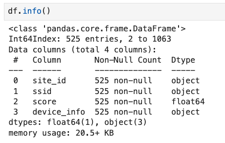
- df.info()
- df.head()
- df.describe()
- df.shape
df.head() will show you the different features and their datatype. Assuming you followed the Python script in step 1 you should see something like this:

STEP 3: Data Pipeline
Next, let’s run through the data pipeline. Some of this data may not be relevant to us – for example, we may not want to track degraded user minutes on the guest network. To drop guest data you can use the Pandas “drop” function like so, replacing ‘guestnetwork’ with the appropriate SSID name for your environment:
df = df.drop(df[df['ssid'] == 'guestnetwork'].index)We may also want to avoid entries that were transient – dropping records where the total number of minutes was less than 2:
df = df.drop(df[df['total'] < 2].index)In some cases a client may be tucked into a heavy duty drawer and shut away for a while but remain active on the network. Fine tune this to your environment, but let’s drop entries with > three hours:
df = df.drop(df[df['total'] > 180].index)Now for some feature manipulation – IE, creating new columns from the values in existing columns. I will take the “duration” and “degraded” values and create a new “score” for each client that shows the percentage of time they had healthy coverage at the site:
df['score'] = 1 - df['degraded'] / df['duration']Second, I will combine the device type and device os into a single column:
df['device_info'] = df['device_type'] + ' ' + df['device_os']Next – there are going to be some columns that are not useful when analyzing larger organization-wide trends. Again, fine tune this to your environment – but here are some features that I will drop for the initial analysis:
df = df.drop(columns=['name', 'mac','ap_mac', 'ap_name', 'wlan_id', 'vlan_id', 'total', 'duration', 'degraded', 'device_type', 'device_os'])You can then execute another “df.info()” to show how the data has been pruned down. We’re going to be looking at the site, SSID, device details, and the coverage “score.”
Our data is now streamlined and unnecessary data has been removed.
We may still have more work to do though … most of our features are categorical. Some machine learning models do not deal well with label data; in that case we need to leverage something called “One-Hot Encoding” to flip the categorical variables into 0s and 1s. SK Learn offers a OneHotEncoder module:
from sklearn.preprocessing import OneHotEncoder
cat_encoder = OneHotEncoder(sparse_output=False)
Next, we need to trim out the categorical columns, bring them into a separate dataframe, and then fit our categorical encoder to the data to perform OneHot Encoding.
cat_cols = ['ssid', 'device_info']
cat_df = df[cat_cols]
cat_df_onehot_numpy = cat_encoder.fit_transform(cat_df)
Notice that I named the results “cat_cf_onehot_numpy.” That is because onehotencoder returns the results in a numpy array which will not have header information. We can execute a few lines of code to pull the headers back in and place the data in a dataframe again.
cat_df_onehot = pd.DataFrame(cat_df_onehot_numpy, columns=cat_encoder.get_feature_names_out(), index=cat_df.index)So what does OneHot Encoding actually do? Let’s say our “ssid” column had four potential entries:
- eduroam
- corporate
- guest
- IOT
OneHot Encoding takes those four potential outcomes found in the “ssid” column and creates a column for each one – ssid_eduroam, ssid_corporate, ssid_guest, and ssid_IOT. It then marks the value for each column with a 0 and a 1 to indicate which value was in place for that particular client. This allows the model to effectively learn the categorical data.
Next, pull the numerical features from the original dataframe and then join the numerical and the categorical features together into a new dataframe called “df_massaged.”
num_df = df.select_dtypes(include=[np.number])
df_massaged = pd.concat([num_df, cat_df_onehot], axis=1)
Great. We now have a dataset that can be learned by a machine. Note that one-hot encoding is not always mandatory; some models can work with categorical data natively.
Now, our goal is to identify the different independent variables – namely SSID, site, and device details – and determine how those relate to the dependent variable – which, in this case, is the coverage score. It’s common in ML to label the dependent variable as “y” and the independent variables as “X.”
Using ML we will build a model that can look at the values present in the independent variables for each record and determine how they impact the dependent variable. For example, say we have a laptop running Windows 11 connecting to our corporate SSID at remote clinic XYZ – can we make a reasonable assumption as to whether or not that client will be able to communicate well on the network? Are there strong trends in our data to give us a clue one way or the other?
These two lines of code will take our new dataframe “df_massaged” and split it into the dependent and independent variables:
y = df_massaged.score
x = df_massaged.drop(['score'], axis = 1)
Next, we need to split our data further into train and test sets. The training data will be used to build the model – the model will run through each entry in the training data and find weights for the independent variable that minimize the error when predicting the dependent variable – and then the test data will be used to validate the model’s performance on “unseen” entries. The code below will create an 80/20 split for training and testing:
from sklearn.model_selection import train_test_split
x_train, x_test, y_train, y_test = train_test_split(x, y, test_size = 0.2, random_state = 42)
STEP 4 – Training the Model:
We can now import the desired algorithms. There are MANY algorithms out there – each with their own strength and weakness – it’s not uncommon to train multiple models and then select the best one. We’re going to work with XGBoostRegressor for this example.
from xgboost import XGBRegressorXGBoost is an “ensemble learner.” This uses classification-and-regression-tree (CART) as the “weak” learner, where the weak learner uses a branching methodology to step through the training data and finds decision points that minimize the error rate for the “y” value. For example, we can find in the training data that IF client is at “A” site AND device type is “B” AND SSID is “C” then we expect Y to be between 0.8 and 0.9, where each of those “IF” and “AND” statements are branches in the logic. This is commonly known as a Decision Tree.
Decision Trees are easy-to-read but they are prone to overfitting on the training data and the model can be impacted by small shifts in the training data. The advantage of the ensemble learning method seen in XGBoost is that we can take multiple weak learners and pool their intelligence together to get the final outcome. XGBoost is an highly optimized implementation of Gradient Boosting, which works as follows:
- Train the weak learner on the training data
- Compute the predictions of the weak learner
- Compute the residual errors of the previous model by subtracting the predicted values from the actual values
- Fit the weak learner to the residual errors
- Update the weights on the training examples based on the fitted residual errors
- Combine the predictions of all the weak learners to make a final prediction
Implementing this is very straight forward in Jupyter/Python – here we will start the model and then train it across our training data:
xgb = XGBRegressor(random_state = 1)
xgb.fit(x_train,y_train)
We are up and running with the XGBRegressor! Note that this is “untuned” – just because we hit “fit” it doesn’t mean that we have a great solution. We’ll get to hyperparameter optimization in a later section. But now that the algorithm has run, we can leverage an awesome feature called “feature_importances_”:
importances = xgb.feature_importances_
columns = x.columns
importance_df = pd.DataFrame(importances, index = columns, columns = ['Importance']).sort_values(by = 'Importance', ascending = False)
plt.figure(figsize = (13, 13))
sns.barplot(x=importance_df.Importance,y=importance_df.index);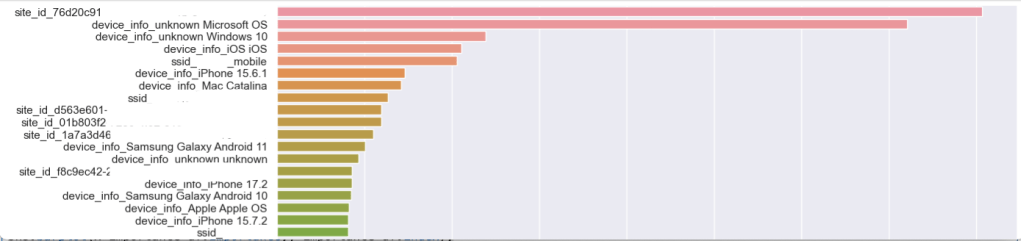
This “feature_importances_” shows us which features in our dataset the algorithm found to be most relevant to our target dependent variable – in this case, the “Score.” Remember, the “Score” is the ratio of healthy to unhealthy coverage minutes across our environment for a client. I’ve hidden the SSID names and Site IDs here, but you can see that we have a site that is interesting closely followed by unprofiled devices running Microsoft OS and then Windows 10 devices.
STEP 5 – Scoring the Model:
Let’s recap what we’ve done so far:
- We gathered data from the Mist dashboard.
- We tuned the data so it could be properly learned by a machine.
- We split the data in a way so that we could attempt to uncover what combinations of location, SSID, and device type might be impacting our coverage score.
- We then fed a large segment of the data (80%) into the ML model as training data. This means that the ML model could see the “answer” to each problem – in this case the coverage score – and then try to determine how the independent variables influenced the answer.
As many of you in the wireless industry know… it’s not always that simple. It’s great if this initial pass reveals interesting correlations in or data. However, wireless coverage can be impacted by a great deal of details – roaming behavior, AP location, client details, etc – and we did not include all of these details in our training dataframe. For that reason it’s important to be able to evaluate how well our model actually performs against the test data (the 20% of data that we kept to the side and out of the training process). Here’s a useful chunk of code that defines several scoring methods:
from sklearn.metrics import make_scorer,mean_squared_error, r2_score, mean_absolute_errordef adj_r2_score(predictors, targets, predictions):
r2 = r2_score(targets, predictions)
n = predictors.shape[0]
k = predictors.shape[1]
return 1 - ((1 - r2) * (n - 1) / (n - k - 1))
def model_performance_regression(model, predictors, target):
pred = model.predict(predictors)
r2 = r2_score(target, pred)
adjr2 = adj_r2_score(predictors, target, pred)
rmse = np.sqrt(mean_squared_error(target, pred))
mae = mean_absolute_error(target, pred)
# Creating a dataframe of metrics
df_perf = pd.DataFrame(
{
"RMSE": rmse,
"MAE": mae,
"R-squared": r2,
"Adj. R-squared": adjr2,
},
index=[0],
)
return df_perfYou can use this to grade your model using this syntax:
xgb_perf_test = model_performance_regression(xgb, x_test, y_test)
xgb_perf_test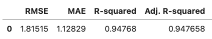
- RMSE – Root Mean Squared Error – the lower the value, the better the performance of the model.
- MAE – Mean Absolute Error, measuring the magnitude of the difference between the prediction and the true value.
- R-squared – This measures how well the model fits. A score of 1 is a great fit; a score of 0 is a very poor fit.
- Adj. R-squared – This adjusts the R-squared value to account for multiple independent variables.
If your metrics aren’t great – and let’s be honest, they probably aren’t going to be great unless you’ve got some really solidly defined trends in your coverage data – you may need to add additional features into your dataset like the ap_mac.
STEP 6 – Tuning the Model:
Often a data scientist will compare the results of several different models and then choose the frontrunner and optimize it further. Every model has its own set of available hyperparameters – individual settings that are tuned by the data engineer to enhance performance of the model. These settings can be tweaked to avoid overfitting and other common problems seen in data science.
You can use a handy tool called GridSearch to automate this process:
from sklearn.model_selection import GridSearchCVxgb_tuned = XGBRegressor(random_state = 42)
xgb_parameters = {"eta": [0.01, 0.1, 0.2, 0.3],
"max_depth": [5, 7, None],
"min_child_weight": [0.5, 1, 2]
}
xgb_grid_obj = GridSearchCV(xgb_tuned, xgb_parameters, scoring = 'neg_mean_squared_error', cv = 5)
xgb_grid_obj = xgb_grid_obj.fit(x_train, y_train)
xgb_tuned = xgb_grid_obj.best_estimator_
xgb_tuned.fit(x_train, y_train)We create a new model called “xgb_tuned” and then pass the xgb_parameters dictionary into GridSearch to list the different hyperparameter settings we want to test. GridSearch will step through the different combinations (eta, max_depth, and min_child_weight in this case) and find the balance of hyperparameter settings that gives us the best possible outcome in the model.
If you’re curious about what I’m modifying in the XGBoostRegressor you can see the hyperparameter documentation page here:
https://xgboost.readthedocs.io/en/stable/parameter.html
Of course the more possible hyperparameter combinations you provide into GridSearch, the more times the model will need to be trained while we look for the optimal combination – this step can take some time! This step is often not feasible when working with large models or neural networks but it works well for machine learning techniques like XGB.
Once you have the new “xgb_tuned” model built you can score it and compare your new metrics against the untuned model. You should see RMSE and MAE decrease and your R-squared value increase.
xgb_perf_test = model_performance_regression(xgb_tuned, x_test, y_test)
xgb_perf_test
STEP 7 – Explaining the Model:
In the world of AI/ML there are models that are considered explainable – for example, Decision Trees. Decision Trees make it very easy to understand why the model made the decision that it did because it clearly spells out the different branching decision points in the tree. This interpretability is critical in some industries (such as finance)… if the model determines that someone is a bad fit for a loan and rejects their application it needs to be able to explain why the loan was denied. Complicated “black-box” models can be more powerful – systems like neural networks or random forests – and these models can do an incredible job of uncovering trends and making predictions… but they are not considered to be explainable; they are natively opaque to human understanding. It’s hard to explain how these opaque models are arriving at their final conclusion.
Enter Shapley.
Shapley is an incredible toolset built to help “explain” AI. Originally developed as part of cooperative game theory, Shapley shows how each feature contributed to the ultimate classification / score assigned by the ML model. I’ll have future blogposts dedicated to Shapley as it’s a fascinating part of the Mist Application Insights platform, but for now we will use the Shapley forceplot to show how our model is predicting coverage scores.
To get started with Shapley:
import shap
shap.initjs()
explainer = shap.TreeExplainer(xgb_tuned)Next, choose an entry from your x_test dataframe. You can quickly identify a few sample entries by using x_test.head(). We’re going to take a look at entry 15 and use a Shapley force_plot to show us why our model decided to predict a coverage score of 0.92 for this record:
variable = 15
chosen_instance = x_test.loc[[variable]]
print('Actual Score')
print(y_test.loc[[variable]])
shap_values = explainer.shap_values(chosen_instance)
shap.force_plot(explainer.expected_value, shap_values[0, :], x.iloc[0, :])
Let’s step through what this sample force_plot means.
- Our model assumes that the base value for “score” is 0.88 – in other words, we expect that 12% of the time the client will be heard at -72dBm or worse (default threshold in Mist). That’s our starting point before we start looking at the features and determining if this client will be better or worse than the baseline.
- Our model assumed that this client would see a score of 0.92, better than the 0.88 average.
- The bars in red are features that contributed to an estimated improvement in score – and the bars in blue are features that contributed to an estimated decrease in the score.
- The biggest “win” for this client was the fact that it was not at site_id that began with 76d20c91. Our model learned that this site ID is generally associated with a lower coverage score.
- Additional contributing “wins” for this client was the fact that it was not running Microsoft OS and it was not associated with two APs that were problematic. (I added the individual APs into the feature mix on this run, use caution doing this on a very large environment)
- The biggest “loss” for this client was the fact that it was connected on the “mobile” SSID, something that our model learned is associated with a lower coverage score.
- Up at the top you can see the ACTUAL score for this client – which was 0.99.
If you’d like to dive deeper into Shapley there is great documentation available:
Summary:
I believe that properly applied data science brings a lot of benefit to the modern networking industry. Current-gen AP hardware gives us access to an incredible amount of telemetry – and with the right platform we can use this information to inform our decisions on how we manage and optimize our network.
Regarding this particular blogpost, hopefully you can see that the more data you can analyze, the better shot you have of uncovering correlations in your data. The “interesting-ness” of your results using this code is also completely subject to the circumstances in your unique environment – in some environments this immediately uncovers interesting trends but in other environments we had a very low score for the model as there just wasn’t much interesting data available when just considering device types and sites. Wireless networking is very complex and can not be easily ‘solved’ simply by crunching ap / site / client details. It’s not my intent to illustrate that the role of the WLAN engineer can be replaced by ML techniques; rather, the WLAN engineer can be augmented by applying these techniques to sift through the sheer amount of data available to us.
I’d also like to re-iterate that this post is meant for educational purposes to show you part of what goes into augmenting a WLAN platform with ML; most of what I have covered here is handled automatically within the Mist SLEs. Mist has many AI/ML systems like this running continuously in the background to help optimize the network. For example, Mist leverages an XGBoost model to help uncover throughput issues in the WLAN.
It’s also worth noting that the API call I used for an example here only pulls clients that are impacted by poor coverage. It may be more accurate to do a complete pull of all clients, including those that have 100% coverage.
Let me know if you run into any questions with the code!

One thought on “UNCOVERING COVERAGE TRENDS WITH ML:”